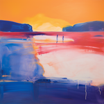
Love this painting?
Want to paint it yourself?
Buy the Paint-it-Yourself Pack for £9.99


Simply add three packs to your cart and and enter the coupon "onefree"
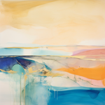
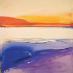
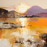
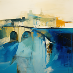
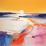
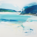
Browse: Similar paintings | All paintings | Same style | Same subject
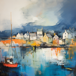
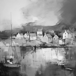
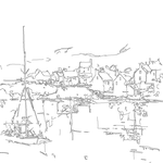
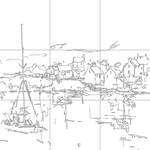
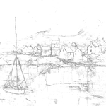
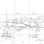
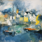
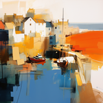
Drag the handle left or right to compare the line drawing with the original painting.


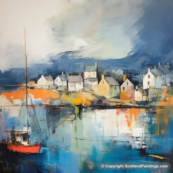
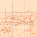
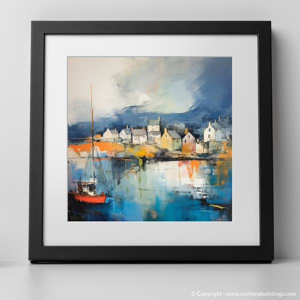
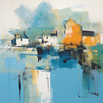
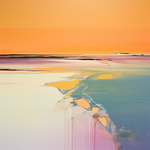
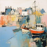
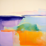
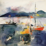
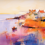
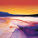
The painting of Millport Harbour captures the serene beauty of a Scottish coastal village bathed in radiant hues. The vibrant oranges and deep blues create a compelling contrast, bringing life to the quaint houses lining the harbour. Reflections ripple across the water, adding depth and movement. The expressive brushwork and semi-abstract style evoke a sense of calm and nostalgia, inviting viewers into its tranquil seascape.
Using the provided grid version, lightly sketch the key elements onto your canvas. This will help define the composition and maintain accuracy.
Start with the sky using broad strokes of light blue and white to create a soft, blended look. Extend these strokes into the water area, mirroring the hues to capture the reflection.
Utilize the line drawing as a reference for the placement of the buildings. Use a mix of white, light grey, and yellow for the houses. Apply loose brushstrokes for an impressionistic feel.
Below the buildings, introduce bold oranges and yellows into the water, using vertical strokes to mimic reflection. Allow some of the brushstrokes to blend into the blues beneath for a natural effect.
Use rich reds for the boat, contrasting with the blues of the water. Pay attention to the black details to define its structure and masts.
Use darker blues and small dabs of darker grey around the edges and in shadowed areas of the buildings. This enhances the depth and adds texture.
With a fine brush, refine the edges, add windows to the buildings, and subtle hints of detail on the boat. Use sparing strokes for a balanced, cohesive finish.
Step back and review. Make any adjustments to balance colors and refine shapes as needed. Remember to maintain the painting’s loose, expressive quality.
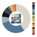
Refer to the included colour wheel to mix vibrant and harmonious colours, ensuring to emphasize the warm oranges against the cool blues that define the painting’s palette.