Love this painting?
Want to paint it yourself?
Buy the Paint-it-Yourself Pack for £9.99


Simply add three packs to your cart and and enter the coupon "onefree"
Browse: Similar paintings | All paintings | Same style | Same subject
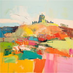
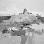
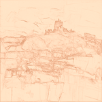
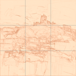
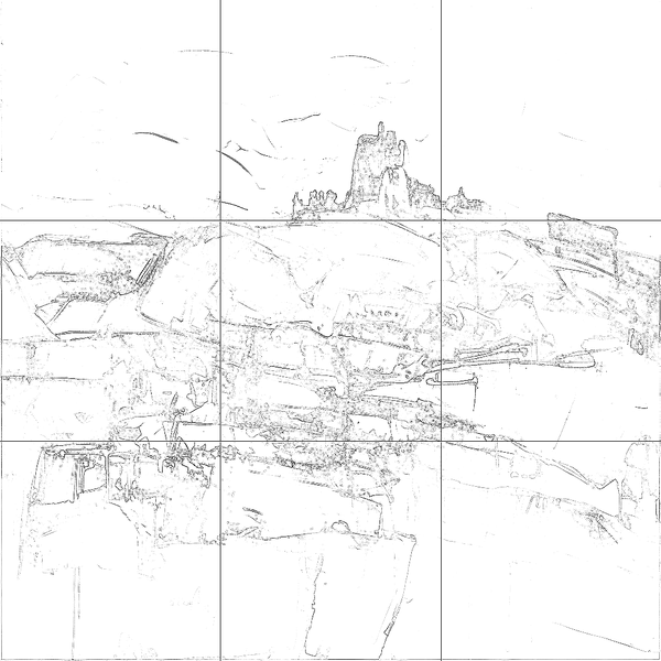
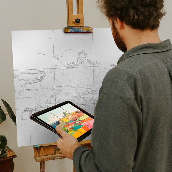
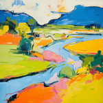
Drag the handle left or right to compare the line drawing with the original painting.
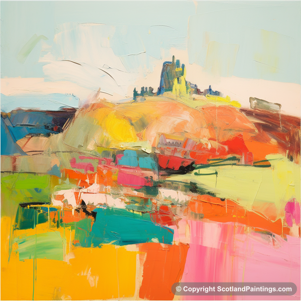
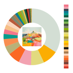
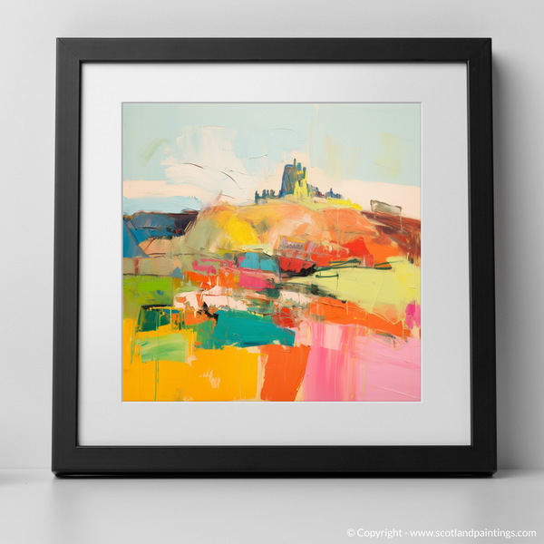
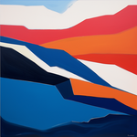
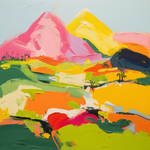
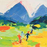
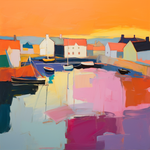
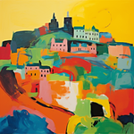
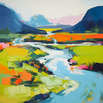
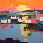
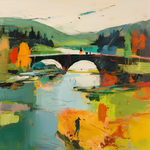
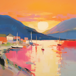
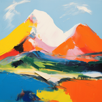
This painting captures the vibrant essence of Edinburgh, Scotland, with an abstract and expressionist approach. Sweeping brushstrokes and vivid colors bring life to the iconic Edinburgh skyline. The use of warm, bold hues such as red, orange, and pink contrasts beautifully with cooler tones like blue and green, creating a dynamic interplay that reflects the city's rich history and modern vibrancy. The composition flows with spontaneity and energy, inviting viewers to explore the landscape through textures and layers.
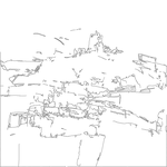
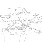
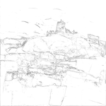
Begin by setting up your work area. Secure your canvas and gather all painting materials close by. Refer to the grid version included in the pack to lightly sketch the primary shapes and outlines on your canvas. Use a pencil or a very light brush stroke to ensure the guidelines are easily covered by paint.
Start by painting the sky in the composition. Use a blend of light blue and white to achieve the soft sky tones. Utilize large, sweeping brushstrokes to cover the area quickly, reflecting the fluidity of the source painting.
Refer to the line drawing to establish the basic shapes of Edinburgh's skyline. Use darker blues and greens to indicate the hills and city silhouettes. Build up the forms with loose, expressive strokes, ensuring the overall layout aligns with the reference image.
Begin to layer warm colors such as red, orange, and pink to define the hills and foreground. Work with a variety of brush sizes to create a sense of depth and texture. Allow colors to intersect and blend naturally, capturing the abstract essence of the original painting.
With a smaller brush, start adding more vibrant accents in areas like the field and skyline. Introduce unexpected pops of color like turquoise and vibrant pink to replicate the dynamic areas seen in the source painting. These details will help in maintaining the energy and vitality of the artwork.
Revisit your composition to add any contrasting elements or highlights using white or lighter shades to balance the bold hues. Stand back and assess the painting from a distance to ensure coherent composition and color harmony.
Throughout the process, use the grid and line drawing as references for maintaining composition accuracy. They serve as guides to help you focus on proportions and spatial relationships in your painting. Do not rely completely on them; use them to inform your artistic intuition.
Enjoy the creative journey and remember that the aim is to capture the feeling and dynamics of the scene rather than reproduce it perfectly. Happy painting!